Thursday, 8 March 2012
Friday, 3 February 2012


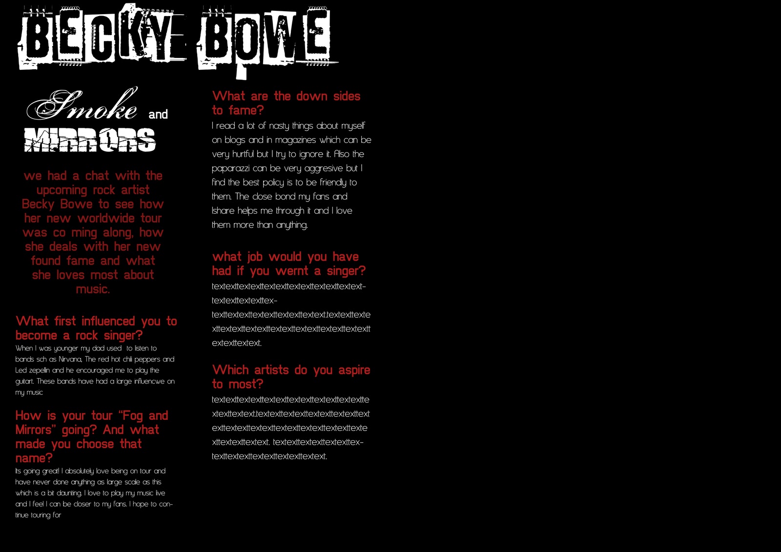
Sunday, 29 January 2012


Friday, 6 January 2012
College Magazine

This is the front cover of my college magazine. It is a draft version and will help me plan my music magazine. It follows the codes and conventions of a magazine with the issue number and date on the cover. It is a medium close up image which is usually used on a front cover as you can see the person properly and there is room to fit cover lines beside. The masthead is big and bold to attract the reader while there are exclamation marks and question marks to intice them.

My college magazine contents page draft has structure with three images going down the right hand side with the features of what is in the magazine going down the left. The images will match contents of the magazine which will attract the reader. It has a simple layout so is easier for the reader.
Wednesday, 14 December 2011
Existing Magazines

After analysing photography plans, I can now see what photography techniques are used in existing magazines. Most if the front cover images have head room to allow space for the masthead. However, other established magazines place the artist in front of the masthead concealing part of the title, but this does not matter as the image is more of the focal point than the masthead as people will immediately recognise the magazine. I found that lead room is found more in double page spreads than on the cover.
Saturday, 10 December 2011
Subscribe to:
Comments (Atom)